Cluster View, Waveform View, Correlation View | |
| Prev | Using Klusters | Next |
The Cluster, Waveform and Correlation Views can be configured in the Parameter Bar shown below. Note that all the specific options discussed in the following sections are available in any display where a given view is present.

This view displays a two-dimensional projection of the data in the PCA feature space. The x and y dimensions can be selected in the Features spin boxes in the Parameter Bar. The x and y axes are drawn as thin grey lines.
The highest dimension corresponds to time. Displaying clusters across time is very useful to assess cell isolation drift. When time is selected as one of the projection dimensions, thin lines are drawn at regular time intervals (60 s by default, but this can be configured).
When moving the mouse over the Cluster View, the pointer coordinates in feature space are shown in the status bar.
The various tools available to modify the clusters displayed in the Cluster View are described in Grouping and Reshaping Clusters.
If the display contains more than one Cluster View, changes to the x and y dimensions only apply to the currently active Cluster View. To activate another Cluster View, simply click in its content area or on its top bar.
This view displays the waveforms of a subset of the spikes evenly spaced in time over the whole recording. The default number of spikes displayed is 100, but this can be changed in the Waveforms spin box in the Parameter Bar. It is also possible to show all spikes recorded within a given time frame: select ->. In the Parameter Bar, the Waveforms spin box is now replaced with a Start time spin box and a Duration text box, where you can define the time frame you wish to see.

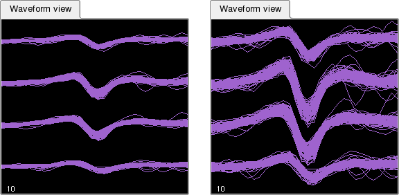
As in the Cluster View, the zoom tool can be used to zoom on a particular portion of the view. An additional way to improve the display is to change the vertical scale using -> or ->. This will modify the vertical axis of all currently displayed waveforms as shown in the example below.
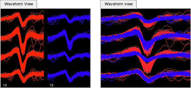
By default, different clusters are shown side by side in the Waveform View. However, in order to more easily compare two or more clusters (e.g. to decide whether they should be merged) it is also possible to show them one on top of the other. Select -> to activate this mode.
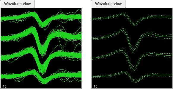
Klusters provides yet another way to display spike waveforms: rather than showing a number of individual waveforms, it is possible to display the mean and standard deviation for each cluster. Select ->. This will draw three curves for each cluster: a continuous curve showing the mean, and two dashed curves showing the mean plus or minus one standard deviation.
Note that the mean and standard deviation are estimated using the selected subset of waveforms (see above).
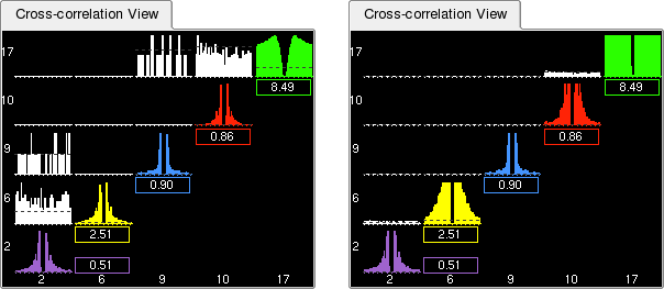
This view displays the auto- and cross-correlations of all selected clusters. By default, the histograms have 1 ms bins and include spikes occurring within plus or minus 30 ms around each spike from the reference cluster. This can be modified using the Bin size and Duration text boxes in the Parameter Bar.
Tick marks on the x axis are spaced as follows:
every 5 ms for durations up to 30 ms,
every 10 ms for durations from 31 ms to 100 ms,
every 20 ms for durations above 100 ms.
When moving the mouse over the Correlation View, the corresponding time in the underlying correlogram is shown in the status bar, together with the IDs for the corresponding clusters.
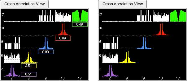
Beneath each auto-correlogram is a small box indicating the average firing rate of the putative neuron. This is also shown graphically as a dotted line on top of the histogram, referred to as the Asymptote Line. The purpose of this information is two-folded: not only does it allow you to distinguish a well isolated neuron with a medium to high firing rate from a group of sparse action potentials with a low firing rate, it is also very useful to estimate how noisy a given cluster is, i.e. what fraction of its spikes belong to other neurons. Spikes belonging to different neurons show up in the refractory period, but their proportion may appear deceptively low when compared to the 'shoulders' of the auto-correlogram. The proper way to estimate how clean a cluster is, is to compare the bins in the refractory period with the average firing rate of the neuron: these bins should represent as small as possible a proportion of the average firing rate. This is where the Asymptote Line is useful (the zoom tool can also help here). Besides, the correlograms can be scaled by their asymptotic value (see Vertical Scale Modes).
However, if you wish to hide this information, for instance when displaying large numbers of clusters simultaneously, select ->.
Similar to the Waveform View, the vertical scale can be changed using -> or ->. This will modify the vertical axis of all currently displayed correlograms (see this Figure).
The Correlation View offers additional scale modes. Each correlogram can be independently scaled either by its own maximum (default mode, also activated when selecting ->), or by its asymptotic value (activated when selecting ->). It is also possible to use the same scale for all correlograms, thus making it easier to compare the respective firing rates: select ->.
| Prev | Home | Next |
| Views and Displays | Up | Trace View |